Reading Response 5

In nearly every city in the United States, homelessness is an issue that can be seen every day. The Bridge Homeless Assistance Center in Dallas, Texas seeks to attack this problem head on, providing a plethora of services for the city’s homeless population. Constructed in 2010, the center has won “Best Architectural Entry” in the International Rebranding Homelessness Competition as well as a multitude of other recognitions. When planned, the site was meant to do far more than simply mask the issue of homelessness; The designers sought to make this downtown site a point of pride in the community.

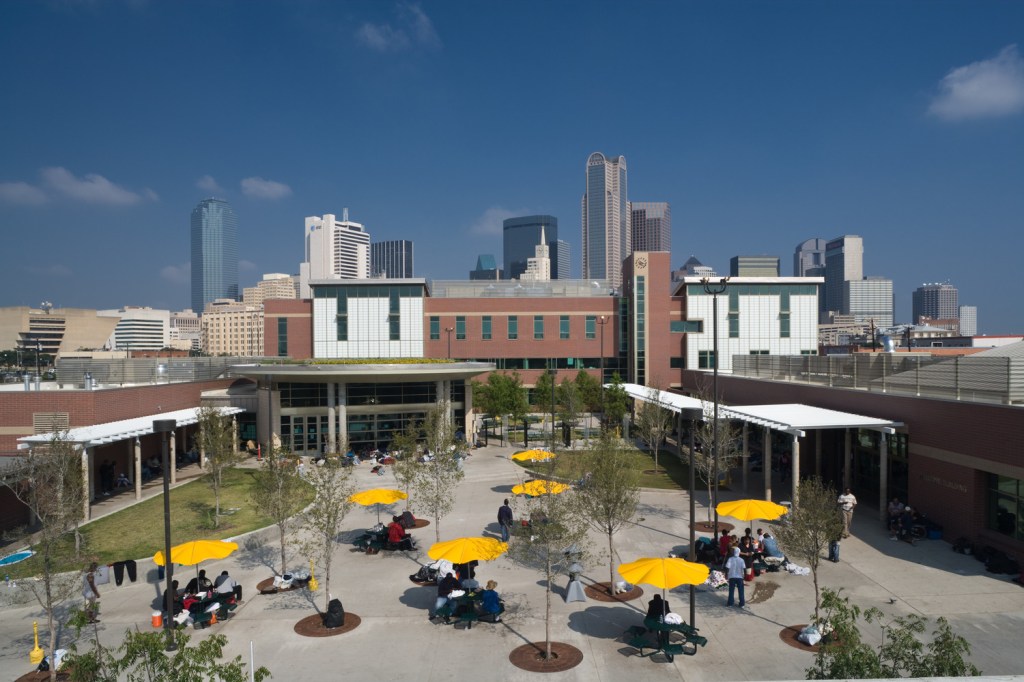
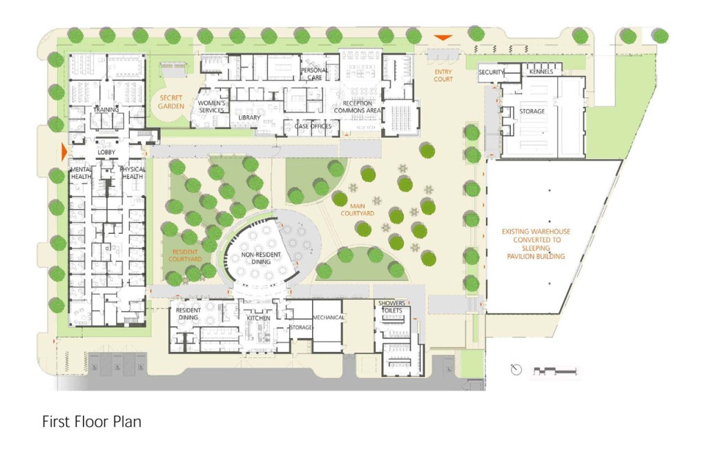
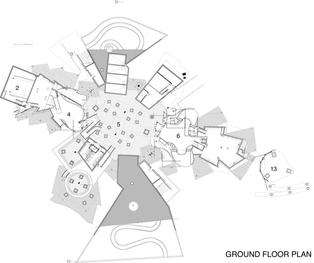
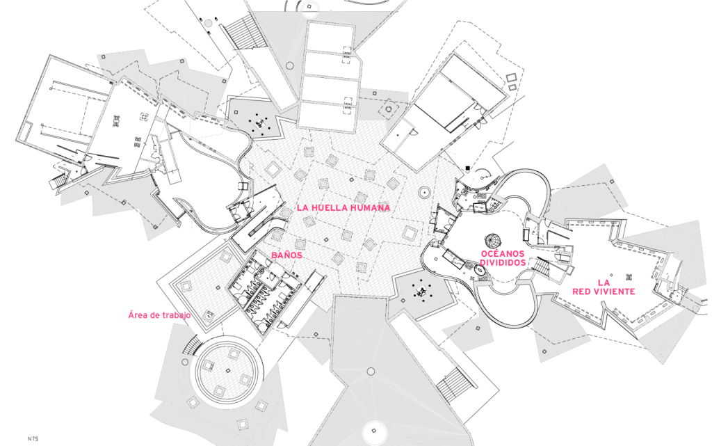
The center houses 76,000 square feet, including five buildings enclosing a large courtyard. Throughout the grounds, homeless people are presented a broad selection of resources ranging from dining and shelter to mental health and training services. Open 24 hours a day and 365 days a year, the Center services over 1,200 homeless people every day, providing them everything from food to advising services in hopes to find them permanent employment and housing. Along with the clear impact on their homeless population, the center seems to have affected the surrounding community as well, as crime in the immediate area dropped by 20% since its opening.

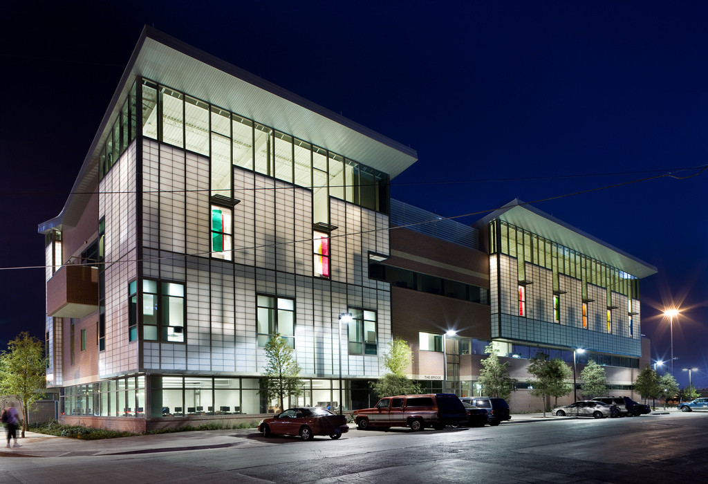
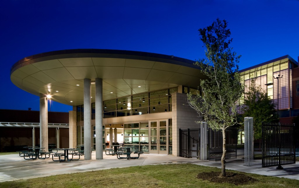
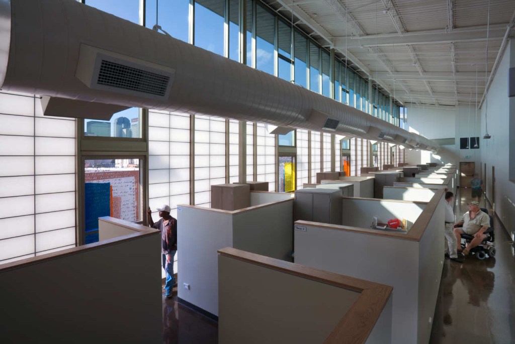
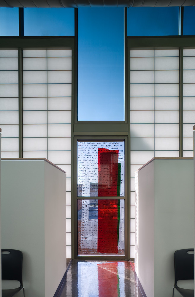
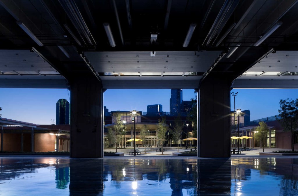
While the services and space to create this change could have been housed in any average building, Overland Architects utilized a sleek, open design to fulfill the project’s needs while elevating the aesthetic of the downtown area. The architecture seeks to create a sense of community by providing a courtyard at the center of the complex. This campus style design fulfills the need to be open yet protected in order to create a comfortable place for those it serves. The inclusion of translucent exteriors serves a dual purpose. During the day, it allows natural light to illuminate the interiors, which range from sleeping spaces to offices. At night, it allows the building to act as a beacon for the homeless in the area, especially in the case of the dining hall’s design. As Crawford states, the uniformity and design of a building can serve to alienate the social group it houses. In order to avoid this, the overall design breaks from the institutional aesthetic that typical shelters embody. By providing an aesthetic that is sleek and inviting, the designers also hoped to create a center that the community could be proud of. They succeeded in doing so, as, according to the Chairman of the Metro Dallas Homeless Alliance, businesses that once resisted the plans for the center recognized it as “the best thing that has happened to the neighborhood.”

Today, over half a million people in the US are homeless. Centers like these drastically help to provide the support necessary to give these people a chance to change their lives. When designed properly, they can touch many more lives, not just in the homeless population but in the rest of the community as well.

https://www.archdaily.com/115040/the-bridge-homeless-assistance-center-overland-partners

Project 2

The creation process for my stool started with contemplating the base geometry I wanted to employ, as well as how to supplement that form. In previous stools, I noticed students utilized basic geometric shapes to distribute the weight, such as triangles, square cross hatches, and hexagons. I sought to do the same, but with the goal of creating a stool that resembled a real stool and employed a simplistic design, as my cardboard was limited. My initial sketches brought me to consider two basic forms: a three and a four legged stool. Both would utilize legs of the same geometry, with increasing thickness towards the base.

I used USPS boxes to construct the legs, cutting them about their folds to create pieces that were symmetric. This allowed one piece to support two legs of the stool while the range of motion of the joint permitted the use of either the three or four legged model. By taking this approach, I was able to test both iterations to determine which to use. Ultimately, I chose the three legged model as the one less leg allowed me to reenforce the entirety of the design. For each side of the stool, I utilized two of these pieces. As a result, each leg had a thickness of four pieces of cardboard, increasing the strength significantly.

In order to hold the pieces together at each leg, I created small pieces of slotted cardboard, created slots on each sheet, and connected them. Additionally, the seat provided geometric structure for the legs, keeping them properly spaced. After testing, it became clear that more structure was needed. The stool would twist when under force, as the cardboard would bend at the creases in the USPS boxes. To combat this issue, I created a triangular frame from three equally sized pieces of cardboard. By bisecting these pieces with each leg, the stool received the proper structural support and could thus support my weight.

While my design is very minimalist in its aesthetic and structure, it accomplished the necessary task and properly embodied what I set out to create.

Stool Update

As of now, my stool is nearly complete. In order to construct the stool, I utilized a cardboard box along with three USPS boxes. With my stool, I wanted to focus my attention on strength, but center the majority of the stool’s structural capacity around a strong, basic geometry. Specifically, I wanted to create a simplistic design that would still resemble a typical stool. By doing so, the tectonics of my stool are quite visible to the viewer. In the conception process, I initially drew a design utilizing four legs with the same shape seen in the current iteration. After designing the pieces, I found that with the amount of cardboard I had that three reenforced legs would serve to bear the weight better than four singular segments of cardboard. Once I made this change, my design consisted of strictly the center triangular structure, with small pieces of cardboard slotted onto each of the three legs in order to keep the pieces together. The three legs were reenforced by multiple layers of cardboard and designed thicker towards the bottom to improve strength, but ultimately this was not enough to bear the necessary weight.

After testing, I realized that the stool was experiencing too much torsional force, to the point that it would warp and become weak with added weight. This was due in part to the lack of structure towards the bottom of the stool. Additionally, the pre-made folds in the original cardboard boxes would buckle under the stress, allowing the stool to twist. In order to combat this issue, I added the triangular frame to the bottom of the stool. While it is not the most aesthetically pleasing buttress, it allows the stool to bear my entire weight. All connections are accomplished via slots, located on each leg at the intersection with the base triangle and the center where the small pieces of cardboard are located. Over the coming days, I will be focusing on ways to improve the aesthetics of the design and potentially reimagine the triangular frame.

Reading Response 4

The heart of this house comes from an appreciation for the fine arts and the great minds that produced them. Every day, the students who pass through are reminded of their brilliance, by both the subtle and bold details. Imagery of some of the most influential artists of all time are captured in stain glass, centered by the words “Blest be the art that can immortalize.” Just as these names have stood the test of time, this building hopes to do the same.

As you roam the halls, you notice that the rooms are unlike anywhere else on campus. High strung ceilings and light design instill a sense of grandiosity, similar to a church. Windows span this great distance, allowing natural light to illuminate the rooms. The combination of the two details creates a sense of wonderment, providing innate inspiration for those who pass through. Wherever you look, intricate details underline these greater ones. The inclusion of these intricacies reminds the mindful viewer of the immense work that was required for every detail in the space.

On the exterior, the heavy construction is as clear as day. Stone arches surround the structure, providing a sense of security for those within. The columns that define the arches are capped by carved, smooth stone, standing in stark contrast to the rough exterior seen elsewhere. With these facets, this space becomes a fortress of learning. It hopes to inspire the next generation to continue to advance the works of those before them, as it provides a safe haven for their thought.

Reading Response 3

REVIEW: Design remains at the center of all architectural education, as it has for over a century. Given the world and its issues have changed since the late 19th Century, I believe this form of education is outdated. I believe design and studio should be a cornerstone of the education, as any architect must understand form to convey their message, but it should not be the main focus. The architect need only know how to design and express their ideas, which can be accomplished with a less intense focus on the topic. By prioritizing an aspect of the field that is really just part of modern architecture, I argue that students become distracted from what should be accomplished with architecture in today’s society. The core of what architecture should accomplish is change, which can only be achieved by understanding and valuing the issues we face. With that, our world in the 21st century pivots at the drop of a hat. With the dawn of technology, new issues arise every day, each requiring different attention and solutions. As a result, I believe more emphasis should be placed on the schooling of contemporary issues. In order to best understand the issues of today and tomorrow, we must understand the issues of just yesterday, and today, more so than the issues of 100 years ago. McDonough flashed a bright light on this concept through the lens of ecology. Humanity’s greatest problem today is in the form of natural destruction, at the hands of an overly industrialized and consumer-based society. In order to best attack these issues, architecture schooling should expose how sustainability has been forgotten in past architecture as much as it has in industrialized society. Conversely, emphasis should be placed on a new form of architecture that strives to be entirely sustainable. While this won’t be achieved immediately, the only way to reach this goal is to equip students with the knowledge and initiative to attack it step by step. For them to truly realize how deeply engrained these issues are, the field should be more self-critical in order to truly change, because there are countless structures existing today that entirely defy our definition of sustainability. Furthermore, it should be stressed that there are ways to improve the sustainability of these very structures as well. New designs and ideas are discovered frequently to improve within this issue, so students should be taught in real time on these topics so as to best utilize them for a better tomorrow.

The Shed

DOCUMENT: The building I chose to analyze was The Shed in New York City. The designers of this building sought to create an adaptable space for the use of artists for the foreseeable future. Its moveable exterior allows for adaptability in scale, and its open spaces provide a limitless scope of uses. To design this building and its moveable stage, extensive education in courses such as Mechanical Systems, Electrical Systems, and Structures were necessary. Reinforced Concrete and Continuous Structure is also needed for the design of the shell, as it is a seemingly continuous piece of material. Furthermore, its aim to pay homage to the Industrial roots of the area suggest an education in a History of Architecture course. The nature of the building as a progressive space implies schooling in Sustainable Design, and its focus towards the performing arts implies a need for education on Acoustic Systems. In order to design such a complex space, CAD in Practice would also be necessary.

INVENT: The course I would create is a Modern Problems in Architecture course, in which the professor would present new, breaking topics and designs in architecture. All topics would need to be on architecture problems and points of emphasis from the year 2000 and beyond. Furthermore, the professor would incorporate cutting edge design solutions into the core information, such as designs created to combat pollution. These examples of new innovation should serve as inspiration for students to see how architects are confronting issues that they can see in their everyday lives. It may also serve to show students how much more change is necessary to truly resolve these issues. This would serve as a course similar to a history in architecture yet be entirely contemporary so as to thoroughly educate students on the climate of current architecture.

Reading Response 2

The plan below, labeled Plan A, depicts Gehry’s Biomuseo with emphasis on creating contrast between the outside world that is a piece of the space he creates and the build environment. Heavy double lines outlining the walls depict which aspects of the building are enclosed and serve a designated purpose apart from the flowing nature of the building. The details within the structures are faint so as to best emphasize the difference between the different domains. The second floor plan, Plan B, emphasizes the distinguishing characteristics of these very same built spaces. The lines that were shown as faint in the first drawing appear with greater weight, even including decorations in the case of the room titled Océanos Divididos. By doing so, greater attention is drawn to the details that distinguish the rooms from one another rather than the openness of the design.

Plan A
Plan B

_________ Domain

I call this domain the Dual Domain because it embodies an important mindset that I use every day, the root of which is attempting to accept everything in front of you. I like to look at things from an all-encompassing perspective: factoring in every variable to see the root cause of issues in this world. From the Dual Domain you can do just that, specific to the University of Michigan. From the deck of this house, you can see both Ross and the rest of Ann Arbor. From the roof, the view only improves. Everything is entirely clear as it is an all-encompassing view of the Michigan experience. In one domain, you can see both the menacing symbol that is Ross and our beloved Big House. This balance of joy and pain, or good and bad, is something that Michigan students experience every day, whether aware of it or not. This dichotomy appears in all forms, but in order to see the whole picture you must acknowledge both sides. While all topics take varying times to reach this general viewpoint, anyone can reach it with patience and an open mind. In the case of this domain, one only needs some courage and balance to see all that Michigan has to offer. “Domain is such an important word in architecture because it allows us to know where we are and how we belong in that particular location” [Lavine, 24]. With this space, you belong TO the domain as you are literally feet from death, yet you are safe if you solely remain calm and enjoy the view. That is the Dual Domain: a space in which you cannot ignore what is in front of you, regardless of your notions of right and wrong.

The Big House
Dual Domain
Ann Arbor
Ross

PROJECT 1

For my AnAlphabet, I have decided to focus on Industrialized Design. In my eyes, the core of industrialized design is focus on function, but solely function. In most of these structures, aesthetic is often forgotten and, at times, entirely disregarded in pursuit of an efficient design. With my project, I attempted to find form in structures that primarily exist for their function.

Design a site like this with WordPress.com
Get started