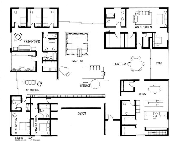
– Dark, thick poche (which additionally represents the dark exterior walls of the house well) sections off the four corners of the house, each with different domains: the kitchen, the parents’ domain, the childrens’ domain, and the servants’ domain
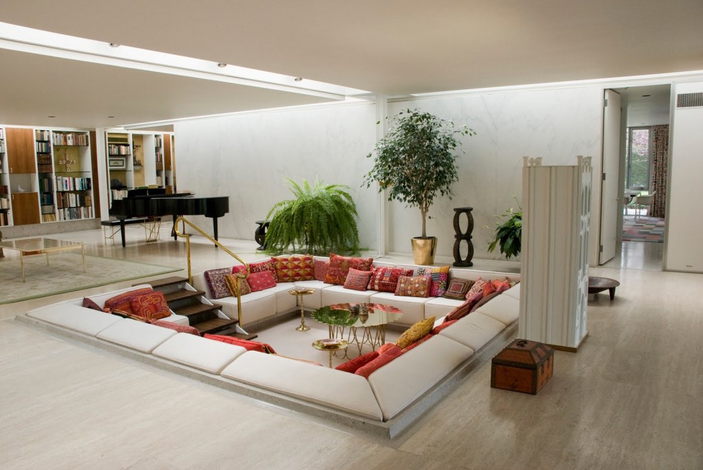
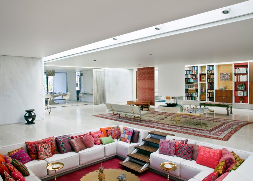
– Shows openness and lightness of central shared domain, with no walls separating the living room from the TV/recreation area or the dining room, and a thinner, lighter poche for the windows to represent the openness and light that they bring in
– Includes the carport and patio, areas that are both interior and exterior spaces
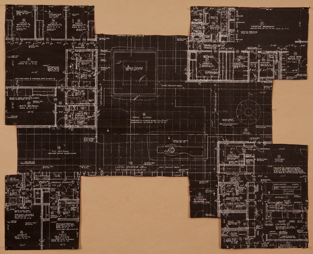
– More specifically labels rooms and depicts more furniture to give a more detailed image of even the smaller spaces
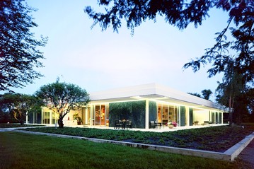
– Heavily uses grid, conveying the modernist style of the house. This is accented by the inclusion of the skylight grid (the dashed line tic-tac-toe grid with the x’s at the four corners), an innovative modernist feature that spreads natural light evenly throughout the house
– Shows, through the skylight grid, the connection between the four distinct domains in the corners of the house, since the skylight grid borders an entrance to each of the four domains.