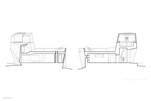
- The two drawings highlight Poche differently. In the first image, it is used with heavier line weights where the other is filled in completely. The blocking of the poche in the second image makes it easier to read the plan.
- The first image also highlights the scale much better than the second. By adding in the human figure it’s easier to understand how large the building is.
- Both drawings show the different domains of the observation tower and how segmented it is.
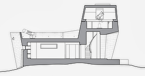
- The second image showcases the uneven terrain better than the first. It even hints at the surrounding landscape.
- Telescopes are turned in a profile for the drawing to help the viewer understand what the object is.
- The window is depicted with a darker line weight in the second image making a clearer understanding of how the building utilizes natural light.
https://www.archdaily.com/885875/gemma-observatory-anmahian-winton-architects?ad_source=search&ad_medium=search_result_projects
