Blog Feed

Reading Response 2

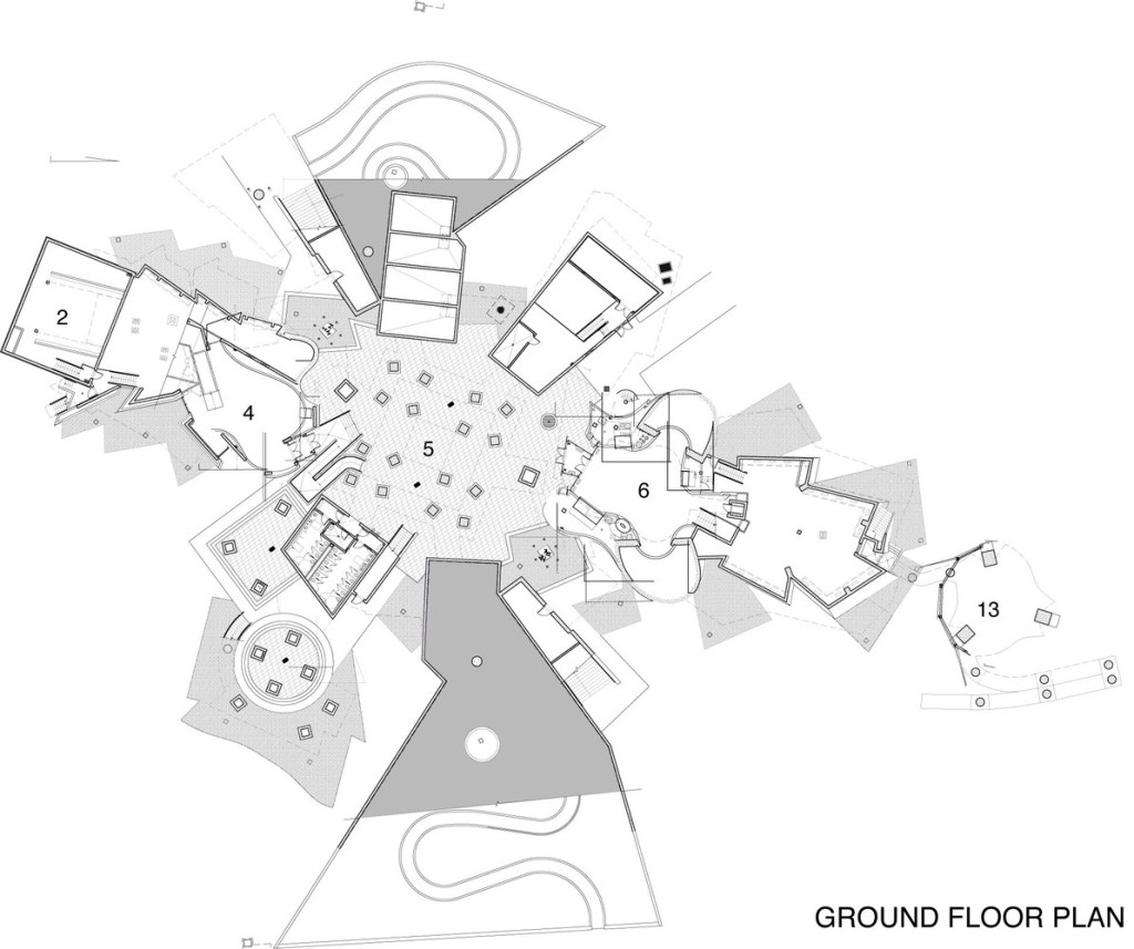
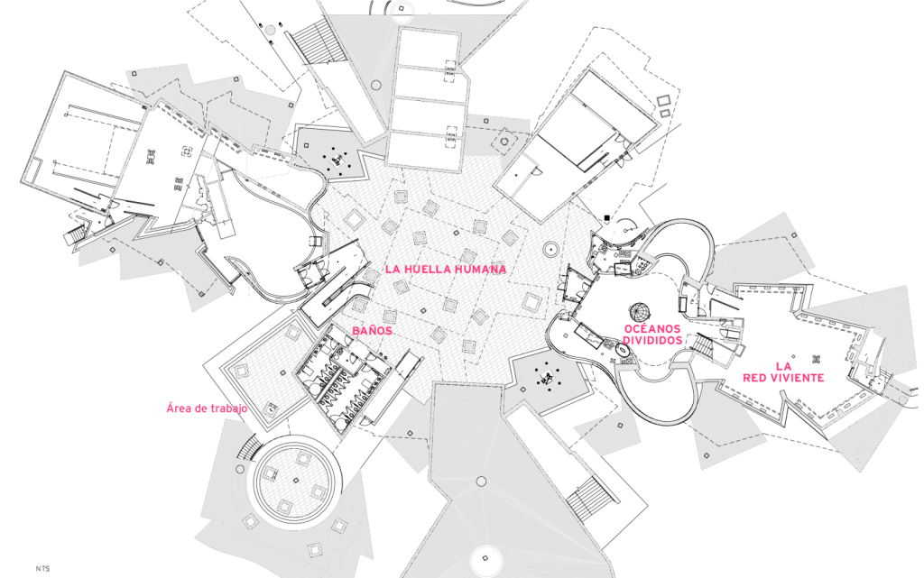
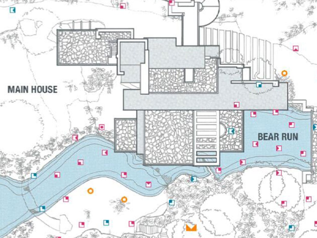
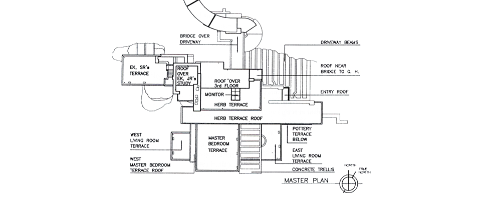
The plan below, labeled Plan A, depicts Gehry’s Biomuseo with emphasis on creating contrast between the outside world that is a piece of the space he creates and the build environment. Heavy double lines outlining the walls depict which aspects of the building are enclosed and serve a designated purpose apart from the flowing nature of the building. The details within the structures are faint so as to best emphasize the difference between the different domains. The second floor plan, Plan B, emphasizes the distinguishing characteristics of these very same built spaces. The lines that were shown as faint in the first drawing appear with greater weight, even including decorations in the case of the room titled Océanos Divididos. By doing so, greater attention is drawn to the details that distinguish the rooms from one another rather than the openness of the design.

Plan A
Plan B

Reading Response 2- Zaha Hadid Heydar Aliyev center

Image result for zaha hadid heydar aliyev center drawings of first floor
In this drawing there is a lot of detail showing the interior of specific rooms including an amphitheater. A wide variety of line widths is included. The poche is more descriptive in this drawing than the drawing below. It even includes details of seating and of stairs. The focus in this drawing is interior design of the individual rooms. This drawing, being so descriptive , would be useful if it were used as a map opposed to the drawing below.


Image result for zaha hadid heydar aliyev center drawings of first floor
In this drawing there is less detail than the drawing above. Only a few line widths are being utilized. Everything feels lighter and more area. The poche is less descriptive in this drawing than the one above. I prefer this drawing it is easier to comprehend. It is simple and straightforward and allows you to easily get a full picture of the building without being chaotic.

Reading Response 2

Image result for toronto rom museum plan
Royal Ontario Museum 

  • Line weight and thick filled in poches are used to clearly emphasize the building walls.
  • Overlapping parts give hint to the dimensionality that the museum has.
  • The varying line weight, with emphasis on certain building parts, creates a collection of segmented areas.

Image result for toronto rom museum plan

  • The line weight is thinner here and poches are not filled in, giving the plan a lighter feeling.
  • More detail is given to the surroundings of the museum with visualization of neighboring roads and greenery.
  • The thin line weight and avoidance of overlapping creates a clearer, easier to read plan.
  • The majority of the lines are the same weight, making the different parts of the museum seem more connected as a whole.

Image result for royal ontario museum topImage result for royal ontario museum

Reading Response #2: Falling Water

– Depicts Falling Water’s interaction with the surrounding green space
– Makes the different textured domains within the house apparent through roof textures
– Shows the structure’s relationship with the featured element: water
– Gives the viewer an understanding of what each space will be used for
– Uses black lines on either side of the walls shows how the space feels less enclosed than it would with solid black poché
– Illustrates the several levels of the house more clearly than the first photo

8-12 Alphabet Photos

I am not 100 Percent set on a theme, however I am noticing a trend of “industry” in the first 8 images. I noticed a lot of metals, pipes, , the smoke stack, and I also took a lot of images in labs and science buildings. The Last 2 images dont really follow the theme as well, however I do enjoy and hope to use them. 45d44f15-1f28-4224-bcaf-d31a4cde1efd9A0C4CE3-537B-4137-AFC7-7931BFAF1A8E4134F1DD-D03C-43B1-B037-AF874249F8CB6F6A9D13-F23C-4B31-8B12-81AA41533B8EBD7CABD0-6284-4A6A-94A2-F5534940B0F289A497FD-B36E-4FAE-B10D-7688879E245BA92197B1-D635-4832-864F-AB2023473160555D1AC3-DB0E-4652-A7BE-7EB24F62B7291A62AD66-CB2A-424E-A3DF-678CCC7103727740C813-3F99-441F-9A55-D57662C58525

Reading Response 1

IMG_0791.JPG

Safe Creative Space

This domain is the Theatrical Design and Production Studio in the Walgreen Drama center. It is a place where people in my major feel comfortable, and spend many hours each day. Every person in my major is provided a large desk, a lamp, and a chair in order to paint, draft, draw or study. Similar to examples Lavine shares, the studio itself is a territory possessed by those in my major- defined by doors and walls; but within the space there are invisible confines of desk domains. Unspoken expectations of individualistic territory are apparent in the studio- we leave our laptops on our desks overnight, some people take naps laying on their desks, and there is an expectation to keep your belongings to the close vicinity of your desk. Each desk is more than a workspace- it’s a domain that is possessed, it’s our own personal territory in the University.
However, the studio itself is also a territory possessed by my community- it’s a place where actors and non-majors are out of place, because there is an exclusive aura within the domain. Rasmussen’s argument about the purpose of architecture is apparent in this space. The large windows, butcher block desks, and industrial design of this space is both practical and pleasing to experience. The setting of this space makes it easy to be creative and productive- the designer of this space was successful in facilitating the intention of the space. The studio is important to me because of the practicality of the space, but also the community I feel when I am there.

Design a site like this with WordPress.com
Get started