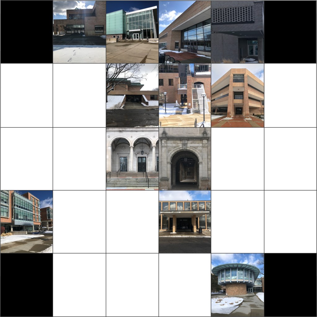
My theme is industrial design- most of these pictures aren’t of things that were designed for aesthetics, they were designed for purpose. Many pictured letters are made out of metal, pipes, and have practical designs. Those that aren’t were taken in and of engineering and science buildings.
I have been able to organize my alphabet photos in this format which I created in adobe illustrator. I also found a solution for my letters not being as visible as I had hoped. In photoshop I am able to make the photos greyscale, and then make only the letter in the photo in color to make sure it pops. I have to collect a few more letters before the project is complete, but am feeling very good about how it is going.
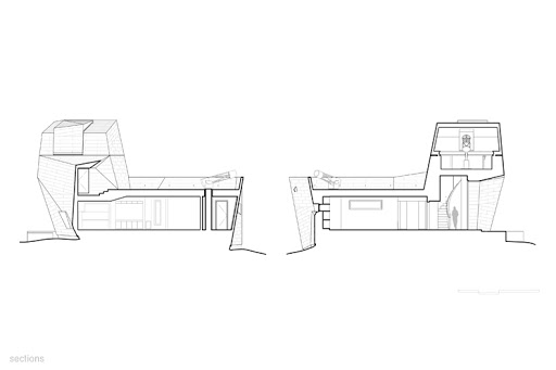
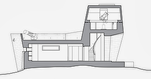
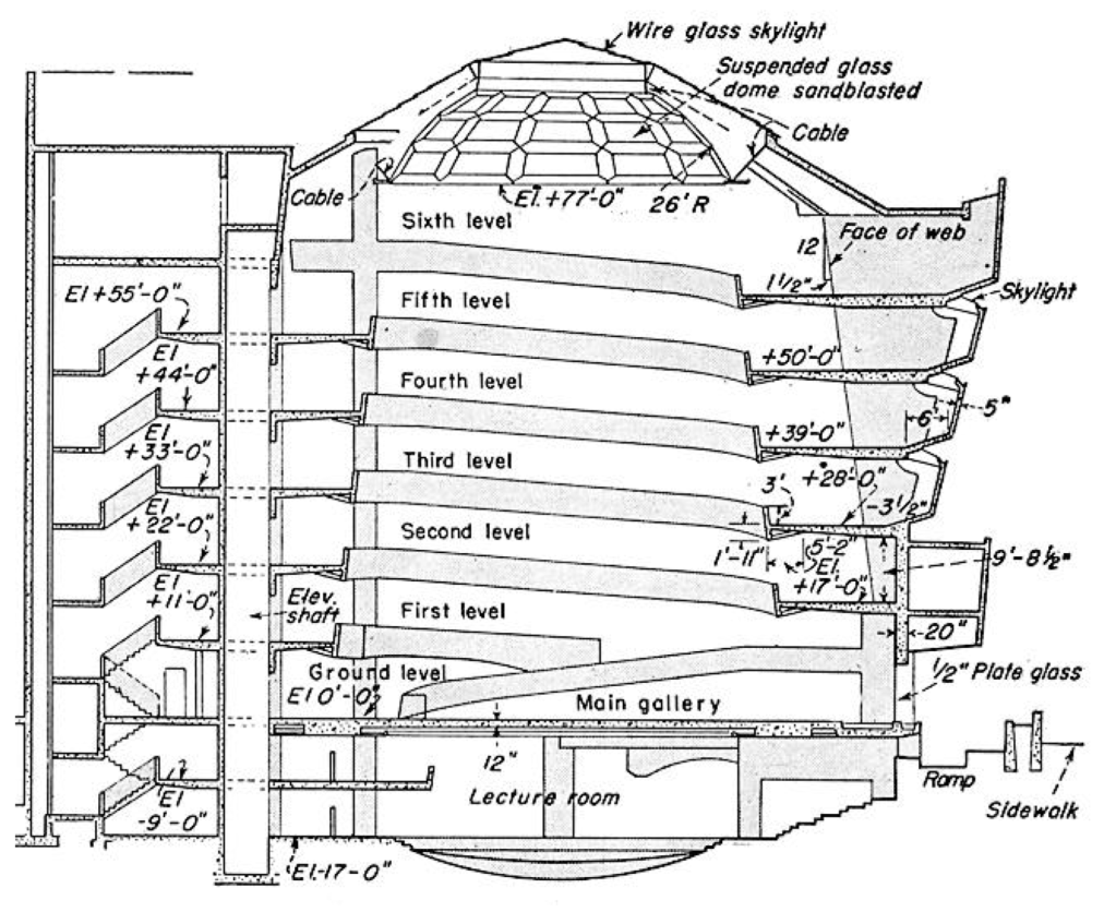
The two drawings highlight Poche differently. In the first image, it is used with heavier line weights where the other is filled in completely. The blocking of the poche in the second image makes it easier to read the plan.
The first image also highlights the scale much better than the second. By adding in the human figure it’s easier to understand how large the building is.
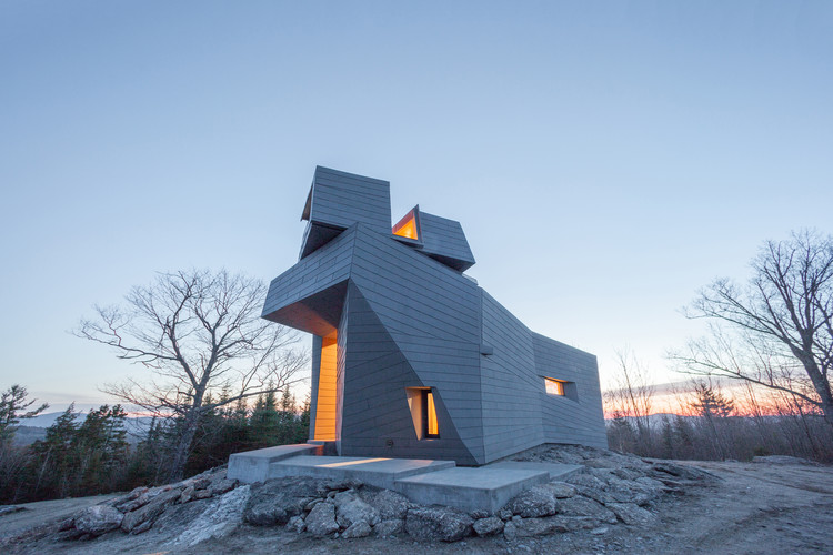
Both drawings show the different domains of the observation tower and how segmented it is.
The second image showcases the uneven terrain better than the first. It even hints at the surrounding landscape.
Telescopes are turned in a profile for the drawing to help the viewer understand what the object is.
The window is depicted with a darker line weight in the second image making a clearer understanding of how the building utilizes natural light.
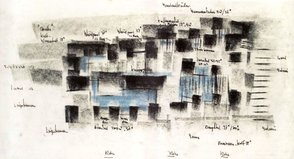
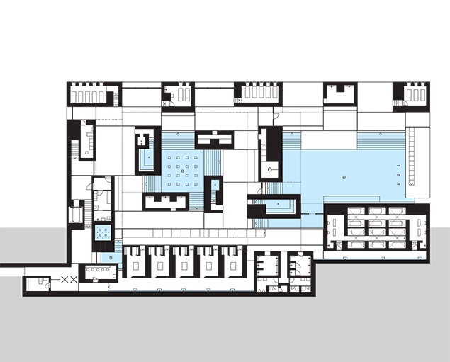
These two drawings are both of Therme Vals by Peter Zumthor which we looked at earlier. The first drawing is more of an artistic rendition of the building, while the second picture depicts more of the practical uses of the different spaces in the building. Additionally, in the first drawing, the spaces are easy to see in terms of the dark shaded areas, as well as how they’re defined by domain. The second picture describes domain in terms of open space and being closed around strict walls.
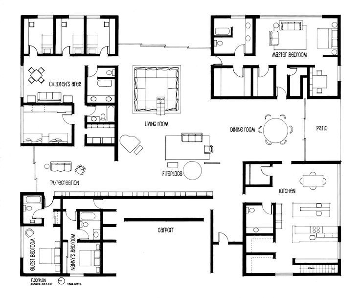
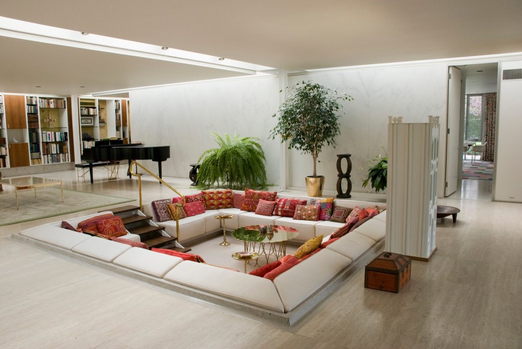
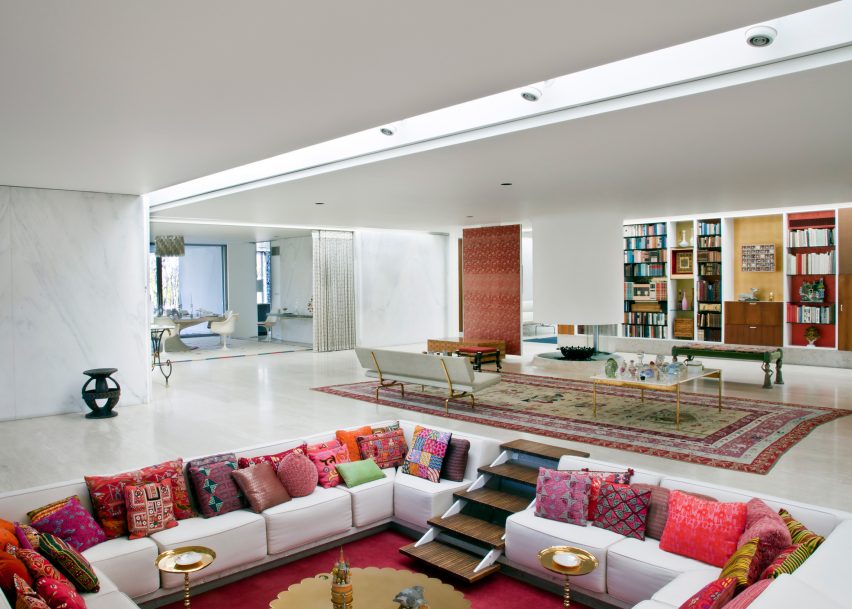
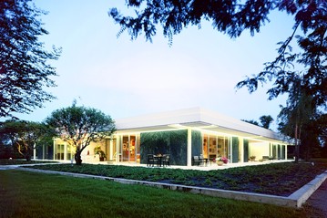
– Depicts the important furniture, and thus the purpose of each area of the house clearly – Dark, thick poche (which additionally represents the dark exterior walls of the house well) sections off the four corners of the house, each with different domains: the kitchen, the parents’ domain, the childrens’ domain, and the servants’ domain – Shows openness and lightness of central shared domain, with no walls separating the living room from the TV/recreation area or the dining room, and a thinner, lighter poche for the windows to represent the openness and light that they bring in – Includes the carport and patio, areas that are both interior and exterior spaces– Includes the accurate dimensions of each room – More specifically labels rooms and depicts more furniture to give a more detailed image of even the smaller spaces – Heavily uses grid, conveying the modernist style of the house. This is accented by the inclusion of the skylight grid (the dashed line tic-tac-toe grid with the x’s at the four corners), an innovative modernist feature that spreads natural light evenly throughout the house – Shows, through the skylight grid, the connection between the four distinct domains in the corners of the house, since the skylight grid borders an entrance to each of the four domains.Example of the skylight bordering a doorway to one of the sectioned-off domainsThe center area of the house is light and airy due to the lack of walls separating shared living spaces, and the large windows and skylight gridExterior of the Miller House
This picture captures the hidden domain that exists between the front and back hallways of Mary Markley Hall. I took this picture through the dining hall window, which is a rare location that gives insight to both sides at once. The exterior of the hallways are constructed of brick and cement, creating a hard, rigid perception of this building. However, the existence of the division between the two sides of the building creates a light feeling for the building, provoking the viewer to question how such thin hallways can sit so easily on the earth. In addition to this, the building is constructed on a hill. This creates a very calming effect on the viewer because the building blends into the earth. The courtyard between the two sides of Mary Markley is similar to the front lawn that Lance discusses; he claims that the front yard “separates each house from the public sidewalk and street while binding us together as a community” (Lance, 30). The courtyard of Mary Markley relates to the front lawn because it separates the residents on the front side of the building and the backside of the building; however, it unites those living in Mary Markley because the windows allow each and every person to connect with the courtyard and with the other side. In addition to this, the courtyard is very private. It doesn’t face a street or a sidewalk; it faces the Nichols Arboretum. Therefore, only Mary Markley residents are aware of this courtyard, so only we get to use it. This courtyard is a secluded, uniting domain.
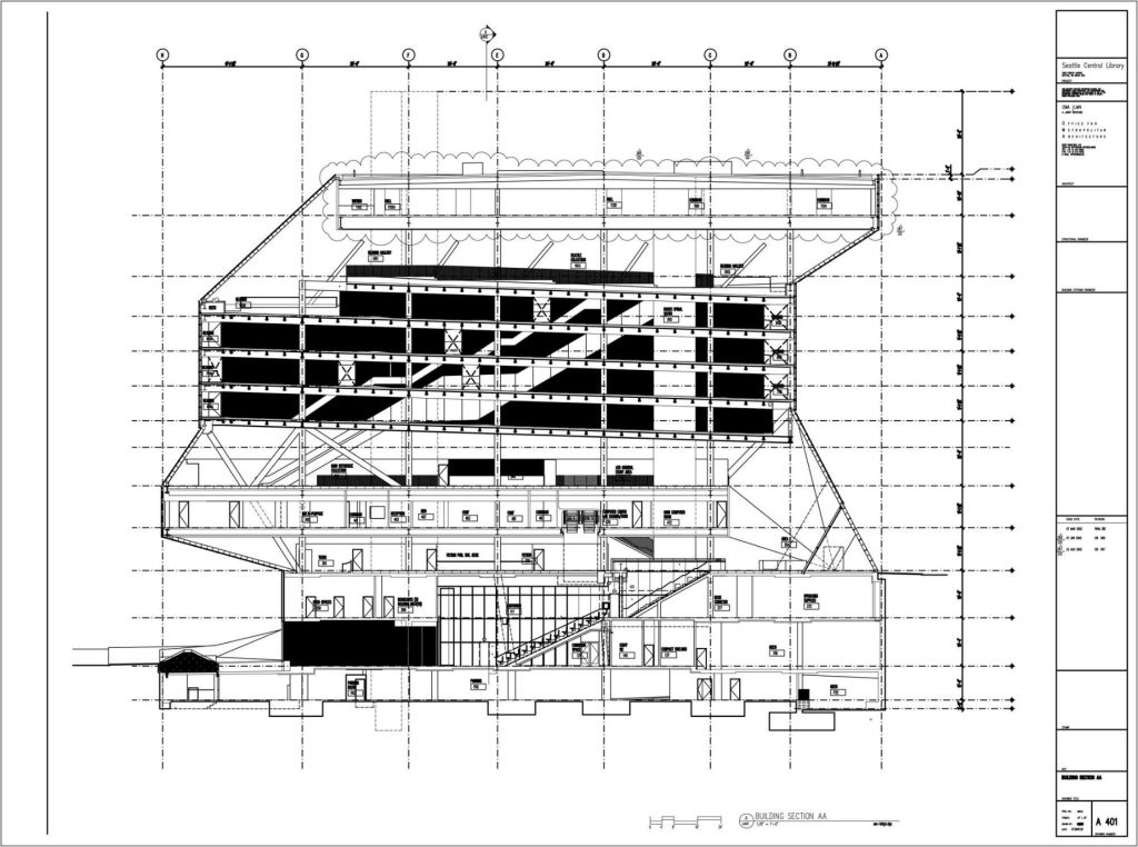
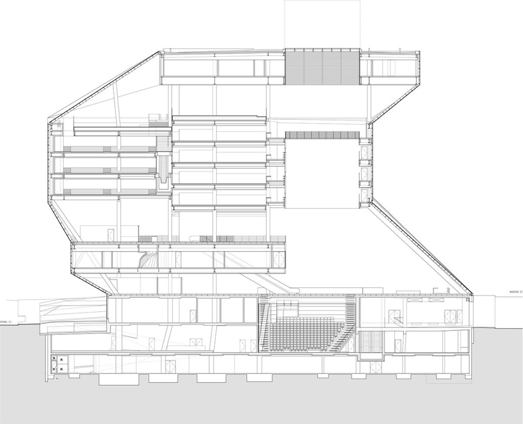
The line weight section drawing of the Seattle Public Library highlights the more functional aspects of the building, such as storage of books and places to study. The poche drawing of the building conveys how the floors work together, giving the viewer a more in depth insight to the experience of the library. Additionally, the poche section drawing elucidates the aspects of the building that function independently of the library purpose.
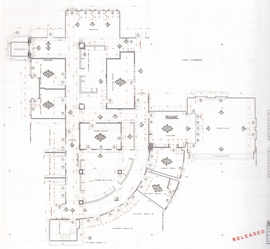
This is the reflected ceiling lighting plan – indicates positions of lighting fixtures, grid emphasises symmetrical and asymmetrical elements of individual rooms, sketches of furniture allow for a better understanding of the set as a whole, useful for lighting designer, set decorator, and cameraman.
This is the technical plan
-Displays measurments and angles, CAD allows for easy revisions, different line weights and colors clarify real elements vs labels/measurements, clear and objective display of space, useful for set builder and construction crew.
These are hospital set design plans from the television show “Mercy”, designed by John Kasarda. The reflected ceiling plan was hand drafted by John Kasarda, the technical plan was made by Ryan Heck in Vectorworks. These examples are from the book “Designer Drafting and Visualizing for The Entertainment World” by Patricia Woodbridge and Hal Tine.
Because this is a set rather than a building, there are not exterior pictures of it. However, in the link to the trailer, the interior of the hospital set can be viewed from 0:30-2:18
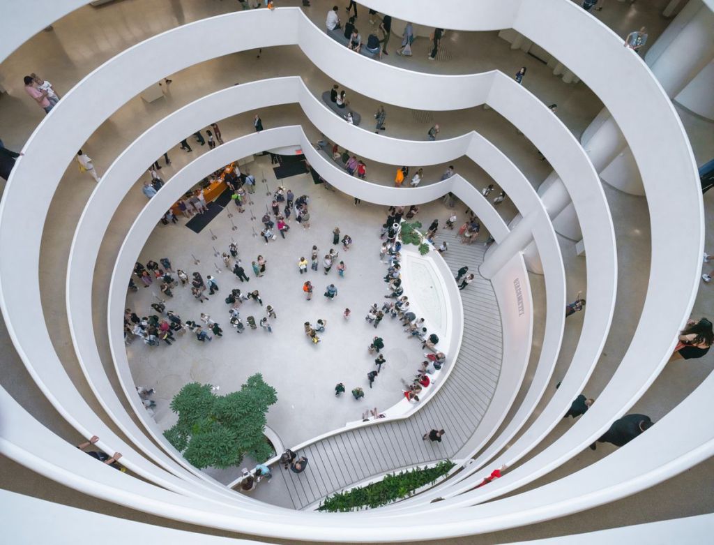
Frank Lloyd Wright’s Guggenheim Museum –New York City
– Shows specifically how the spiral ramp gives access to the art displays – The emphasis is on the ramped walkways and its connection to the galleries – There is a sense of movement and direction of how people would move around the space– Poché is emphasized on the art gallery spaces and its connection to the ground plane – The lighter area in the center indicates heavy emphasis on the outer construction and empty, open area in the center – There is also better attention to the light dome atop to show how light is supposed to be present in the building
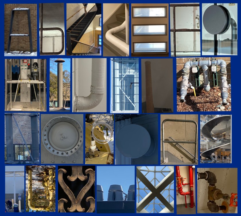 My theme is industrial design- most of these pictures aren’t of things that were designed for aesthetics, they were designed for purpose. Many pictured letters are made out of metal, pipes, and have practical designs. Those that aren’t were taken in and of engineering and science buildings.